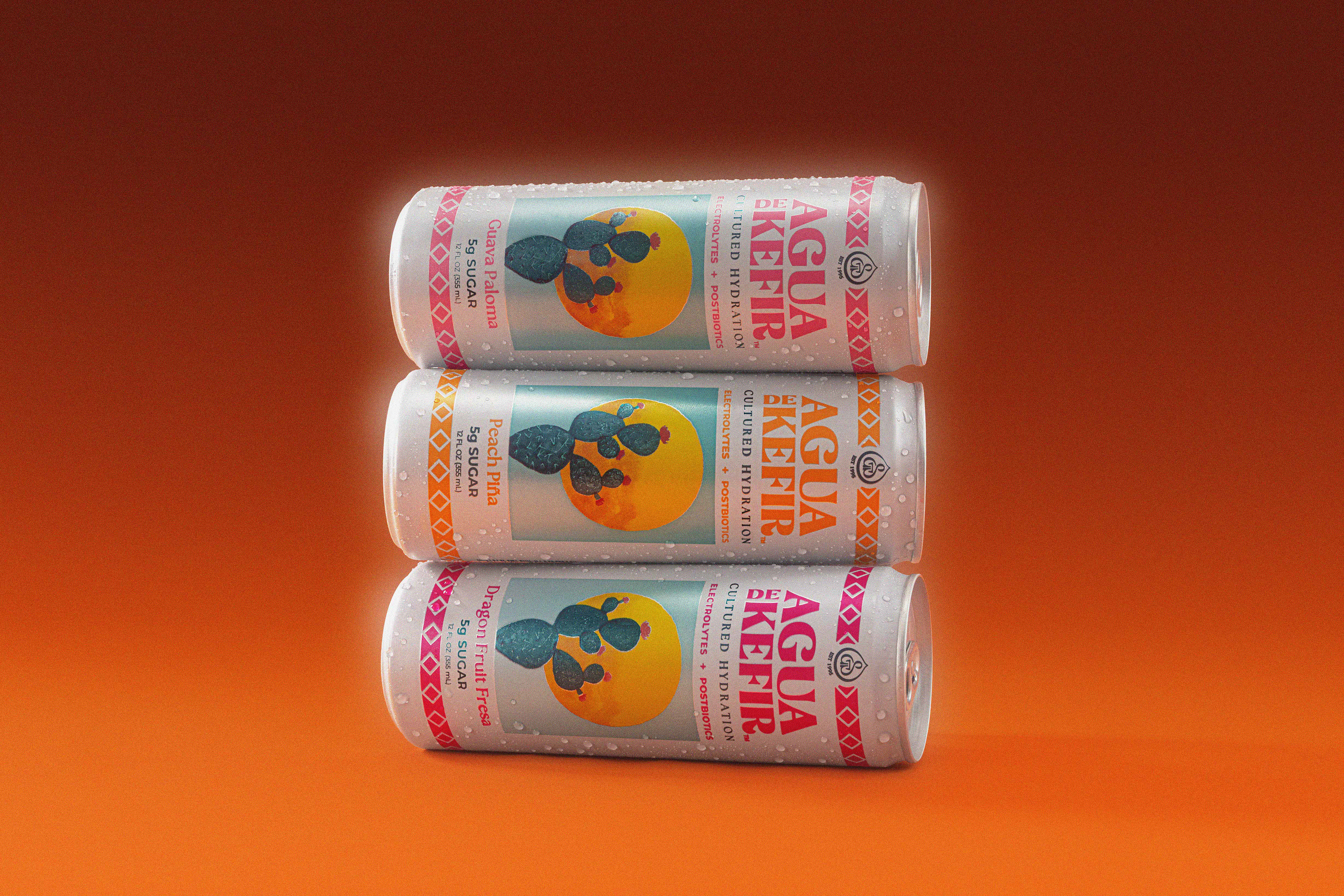
Agua de Kefir underwent a rebrand, which left the existing visual language misaligned with the new logo. The direction draws from retro soda advertising and a bold, “thirst-first” sensibility to create a more expressive, culturally relevant brand. culture.
My role: Led art direction and visual identity development, defining the creative north star and translating it into a cohesive system across campaigns, social, and brand touchpoints.
Before: Lacking a Clear Voice
Prior to the refresh, the brand lacked a cohesive visual direction. Assets felt inconsistent, with no distinct point of view or cultural edge.
The Shift
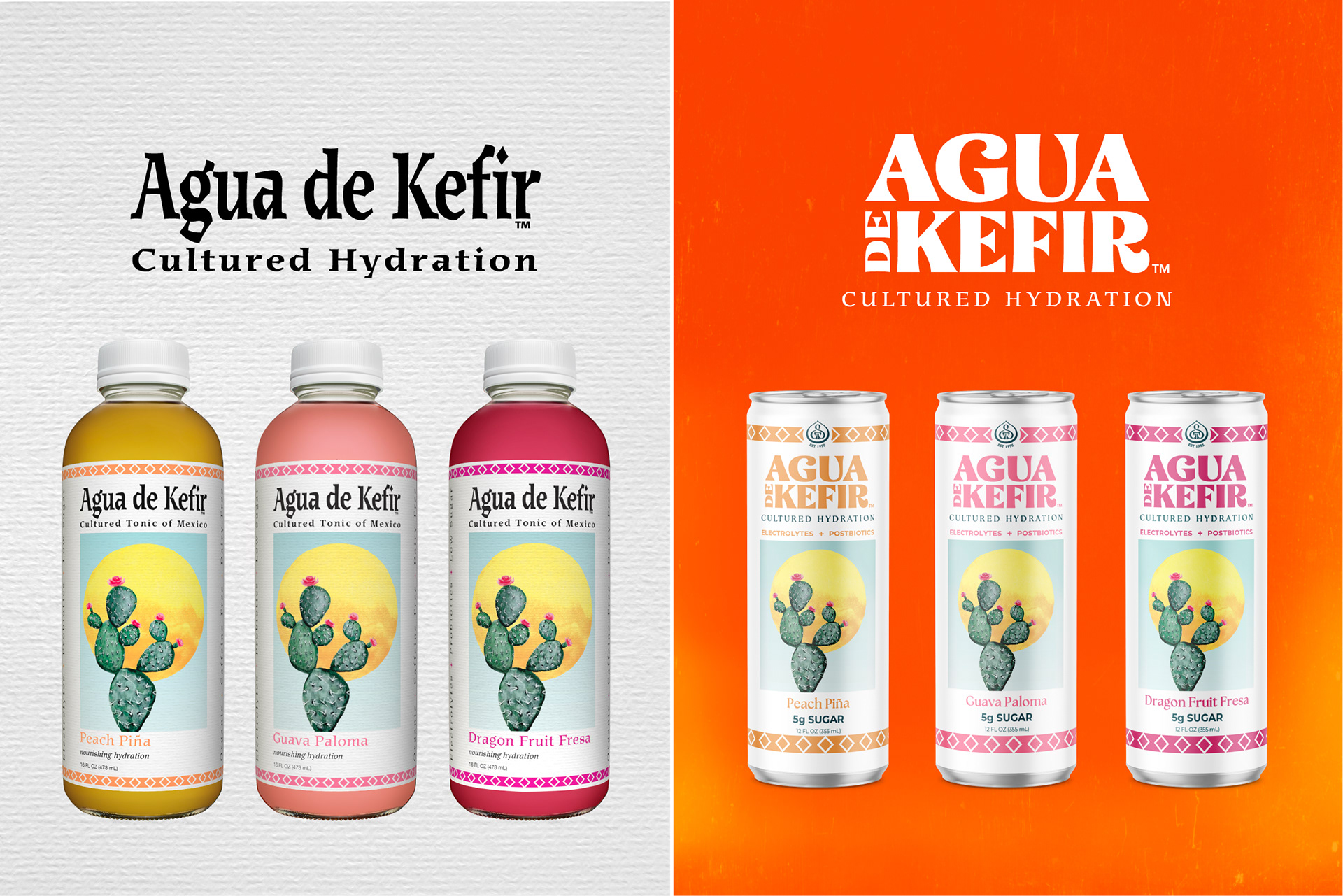
A new logo and packaging system set the foundation. My role was to build the world around it, translating this update into a fully realized, ownable visual identity.
Establishing the Visual Language
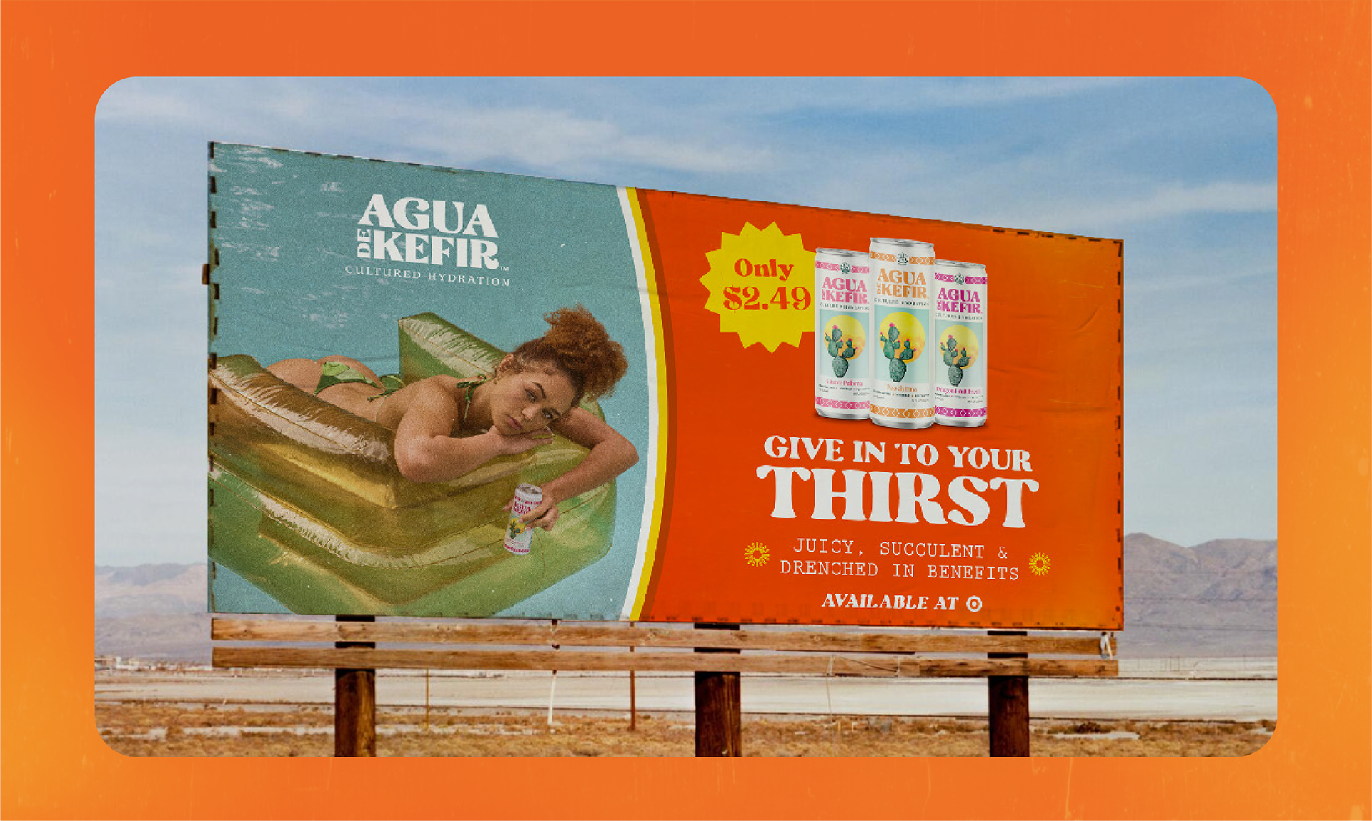
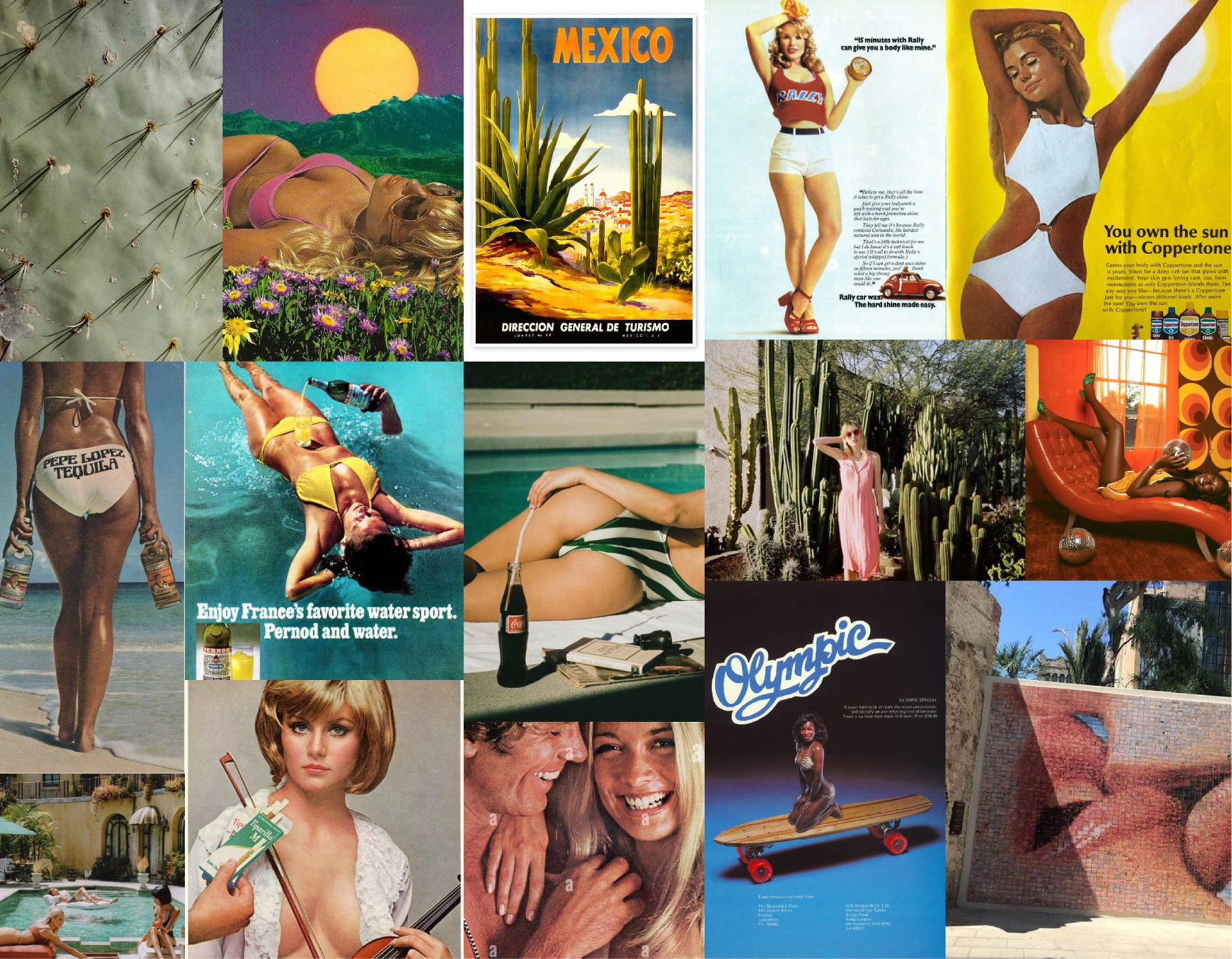
Defined a new visual direction rooted in retro soda advertising, sun-soaked desert tones, and a bold, thirst-driven aesthetic. The goal was to create something instantly recognizable with a clear, ownable point of view.
Building the System
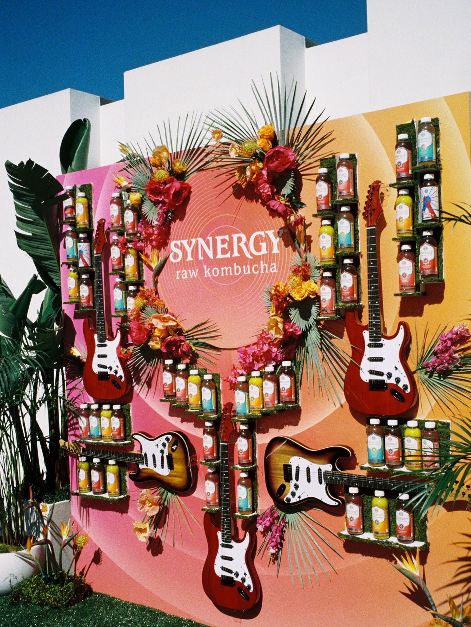
Translated the creative direction into a scalable visual system, defining color, lighting, composition, and typography to ensure consistency across every touchpoint. Built to move fast while maintaining a clear, cohesive identity.
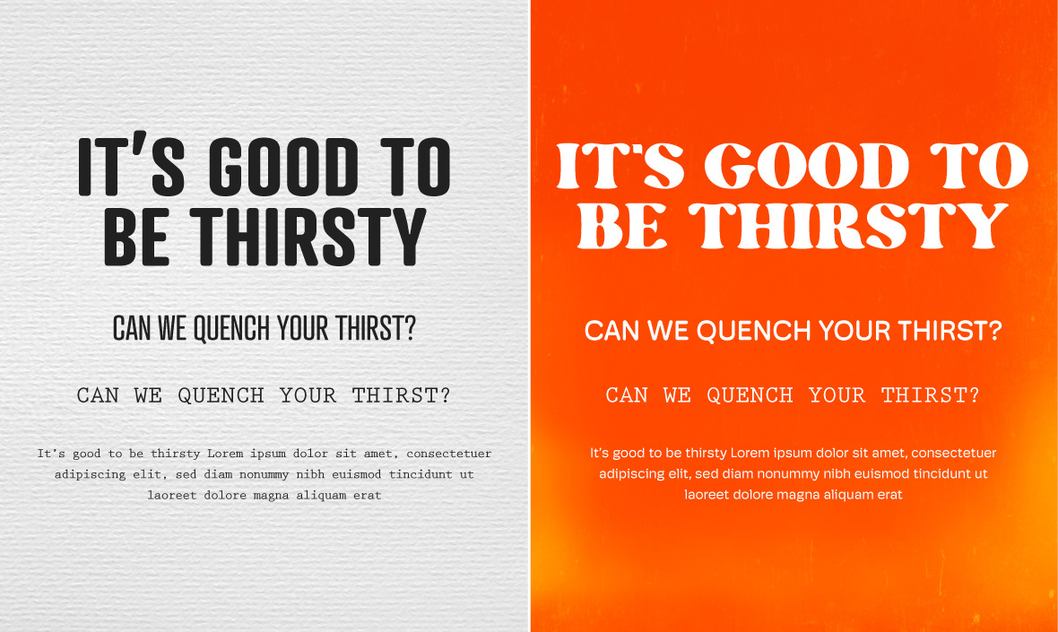
Old vs New Typography
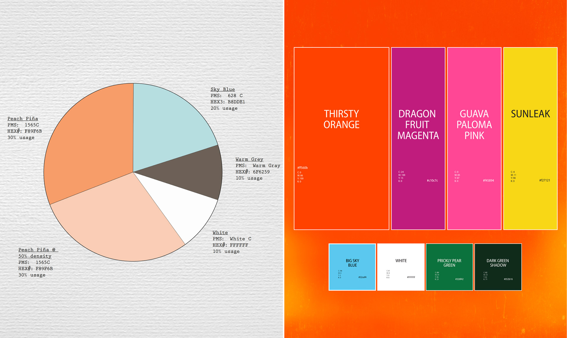
Old vs New Colors
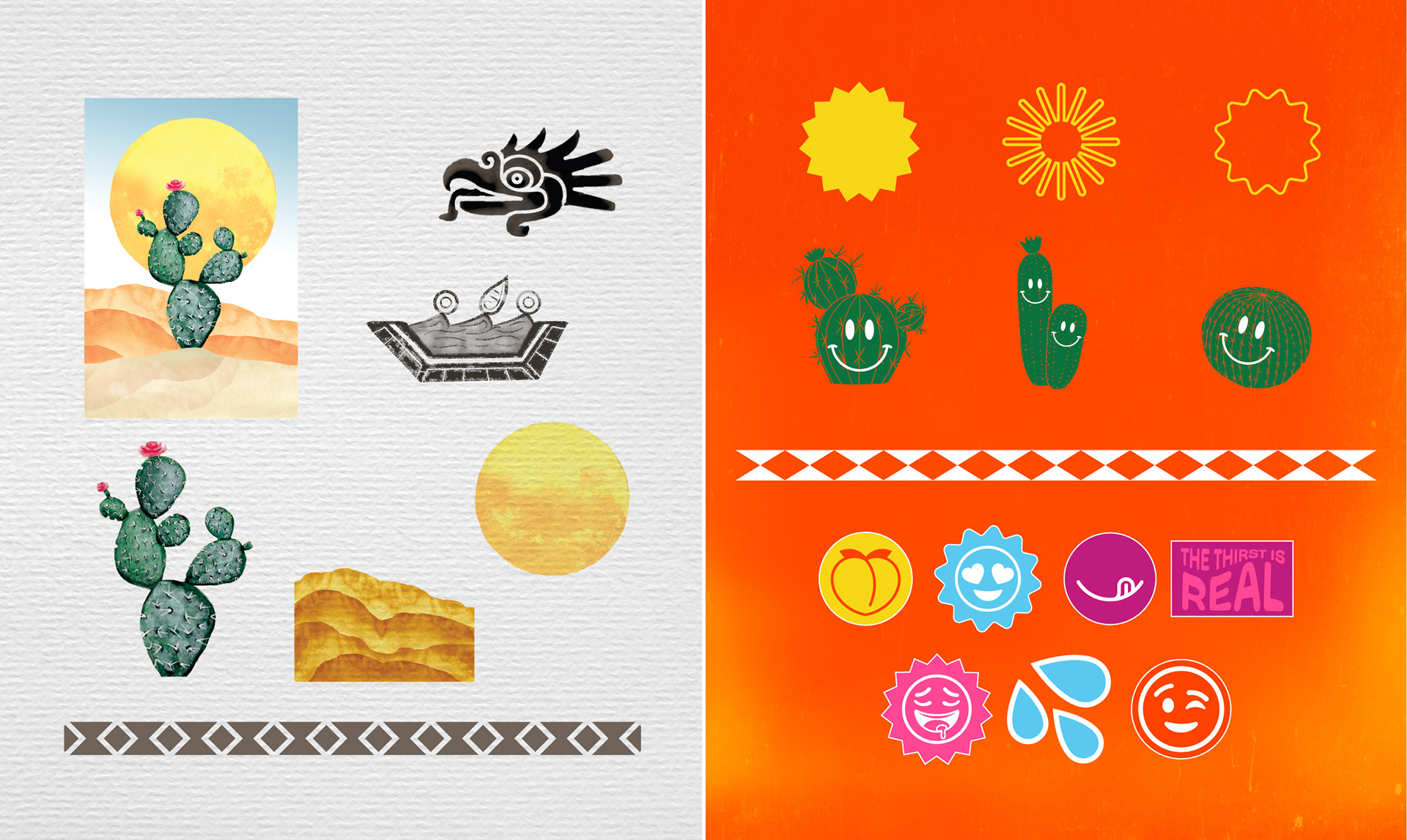
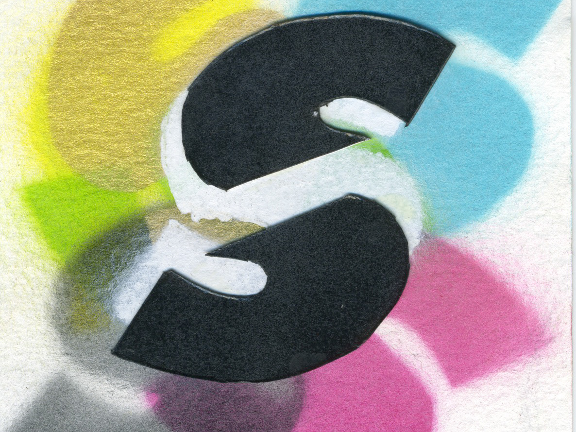
Old vs New Illustration Elements
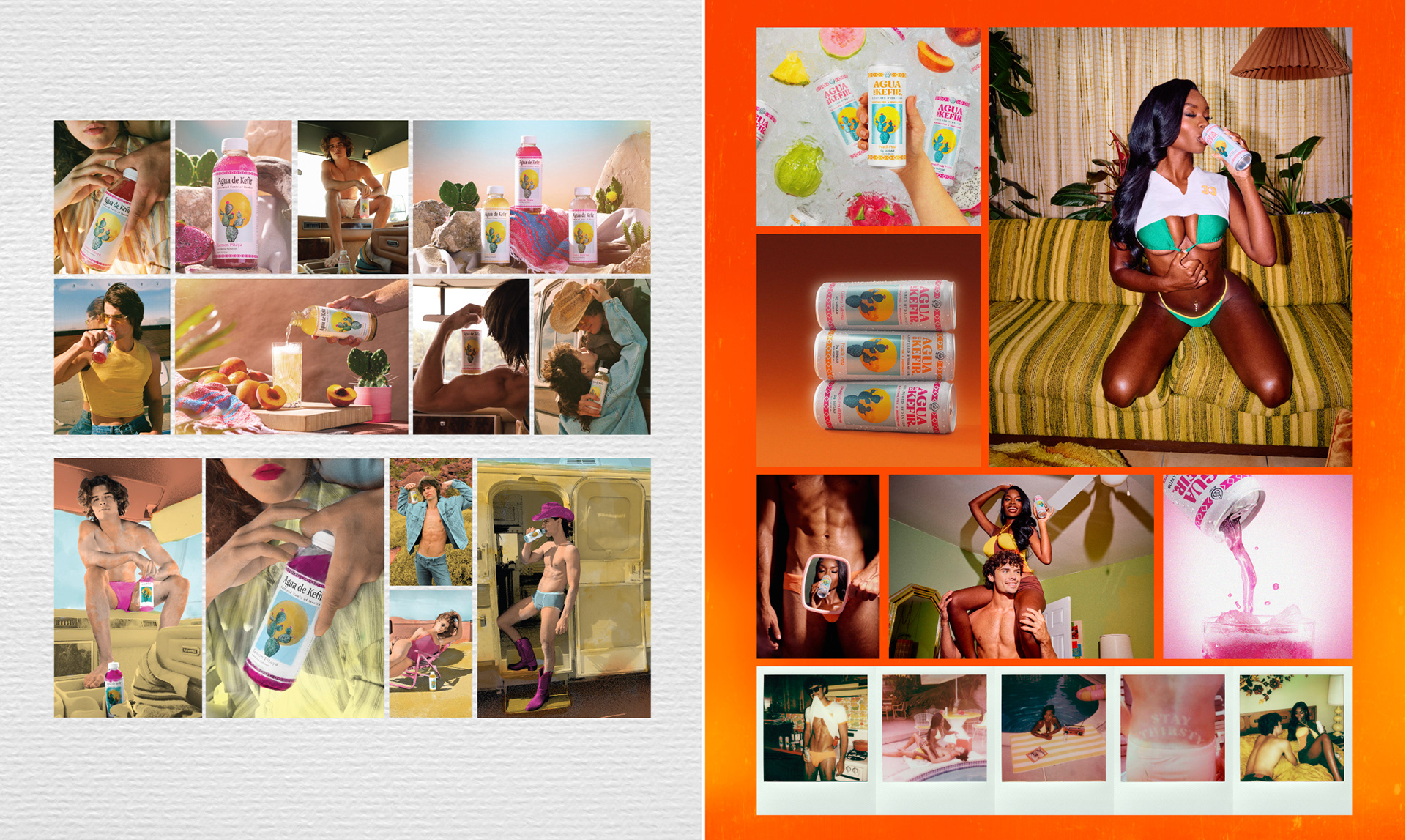
Old vs New Photography
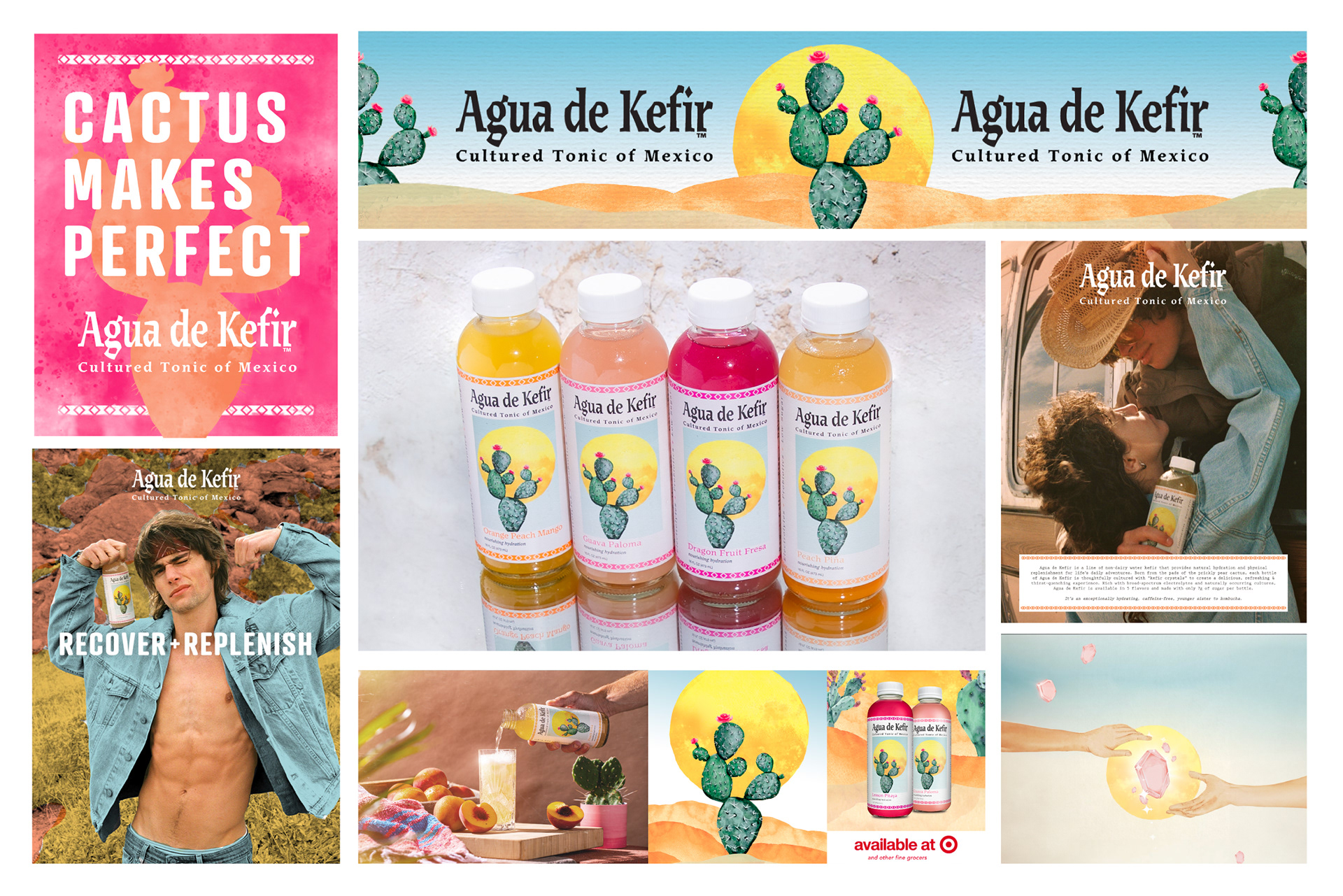
Application
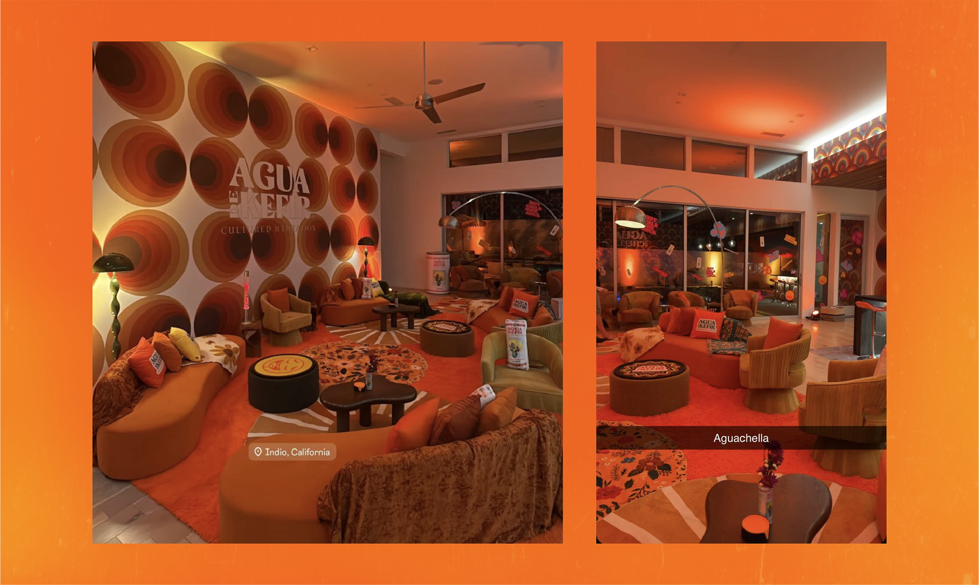
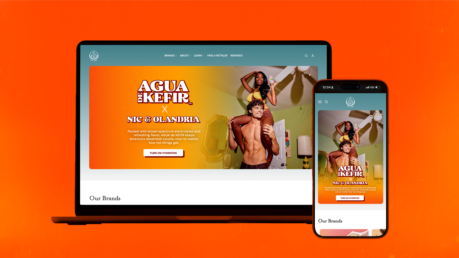
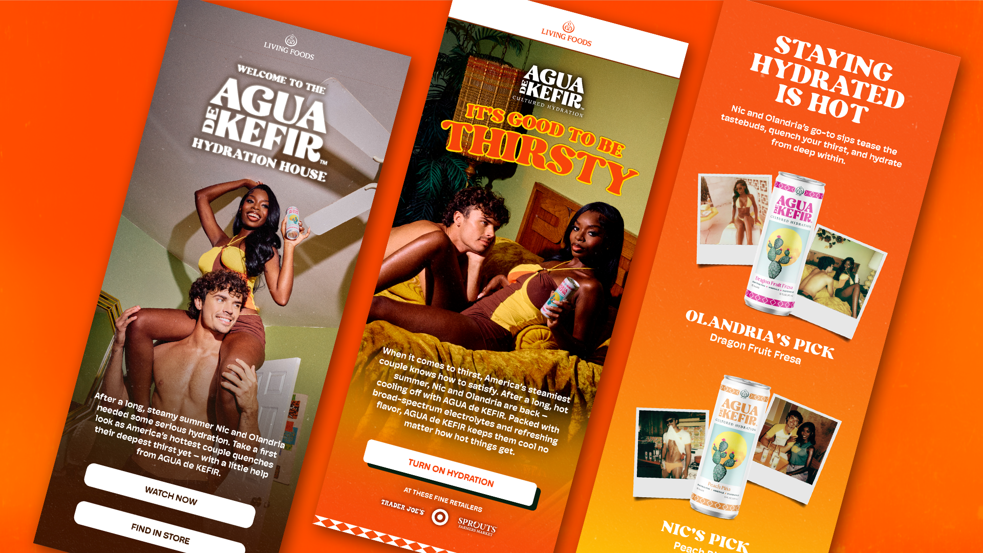
Brought the system into the real world, translating the identity into cohesive, immersive brand experiences across physical and digital touchpoints.