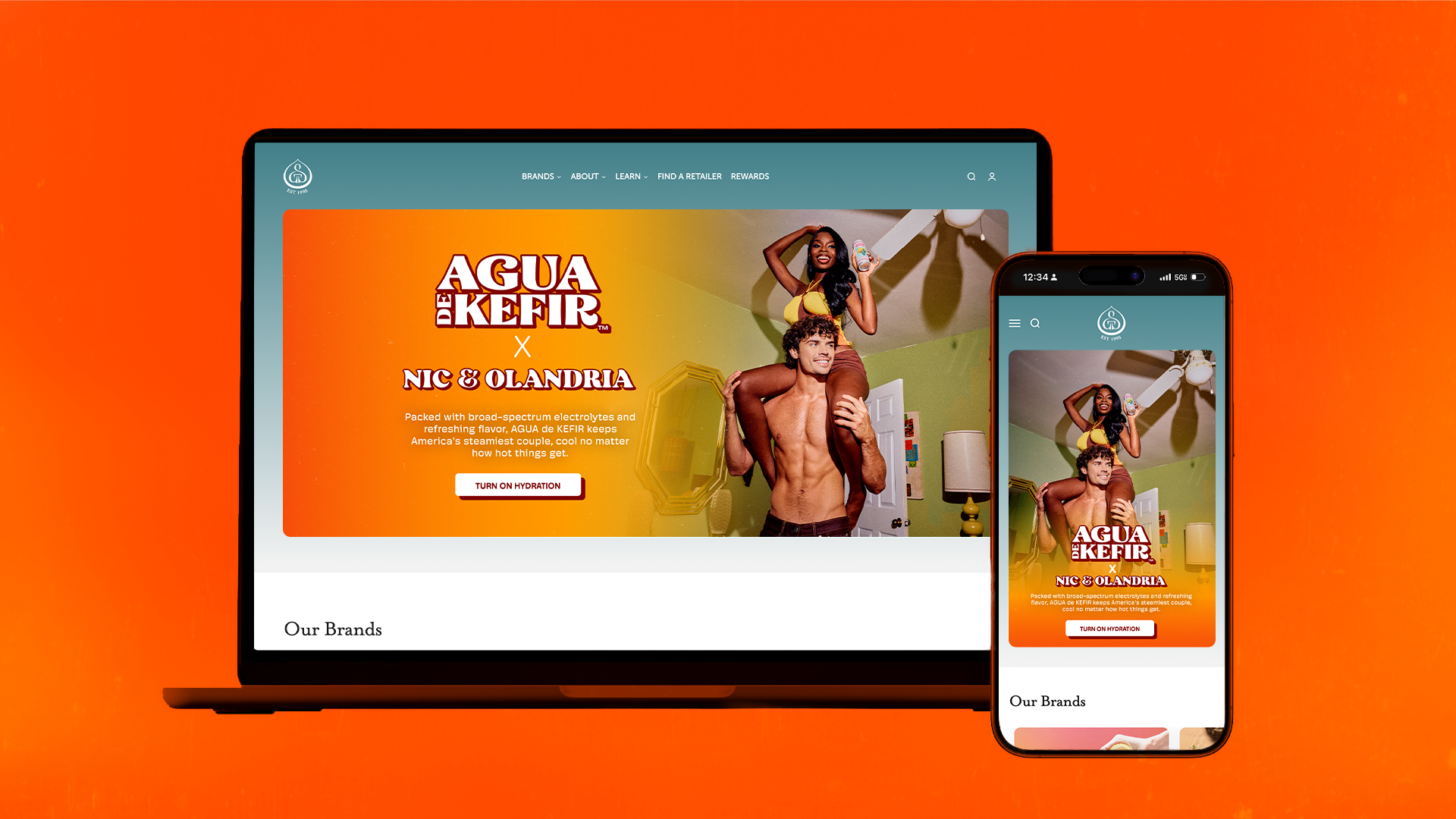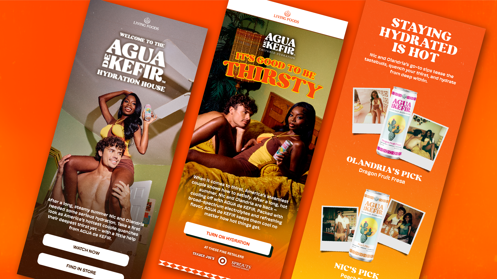
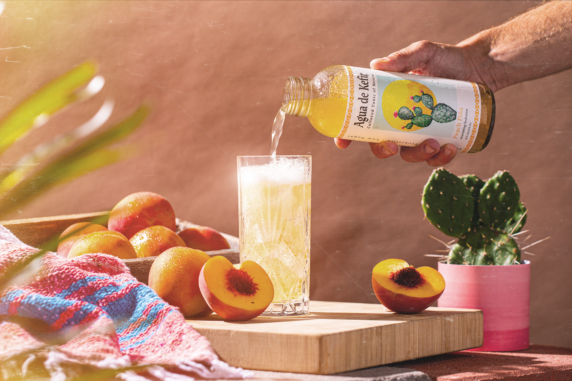
Agua de Kefir underwent a rebrand, which left the existing visual language misaligned with the new logo. The direction draws from retro soda advertising and a bold, “thirst-first” sensibility to create a more expressive, culturally relevant brand. culture.
My role: Led art direction and visual identity development, defining the creative north star and translating it into a cohesive system across campaigns, social, and brand touchpoints.
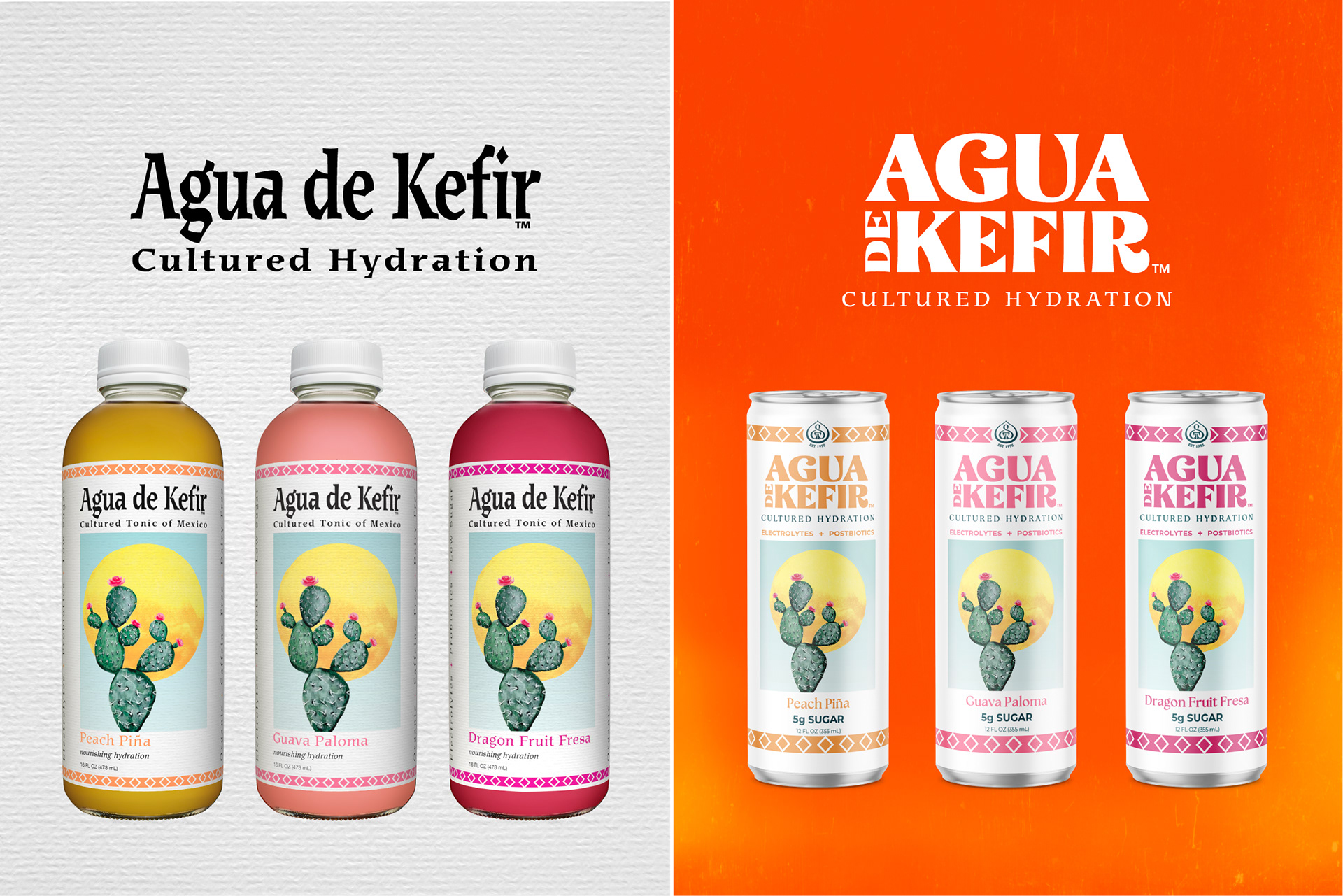
Before: Lacking a Clear Voice
Prior to the refresh, the brand lacked a cohesive visual direction. Assets felt inconsistent, with no distinct point of view or cultural edge.
The Shift
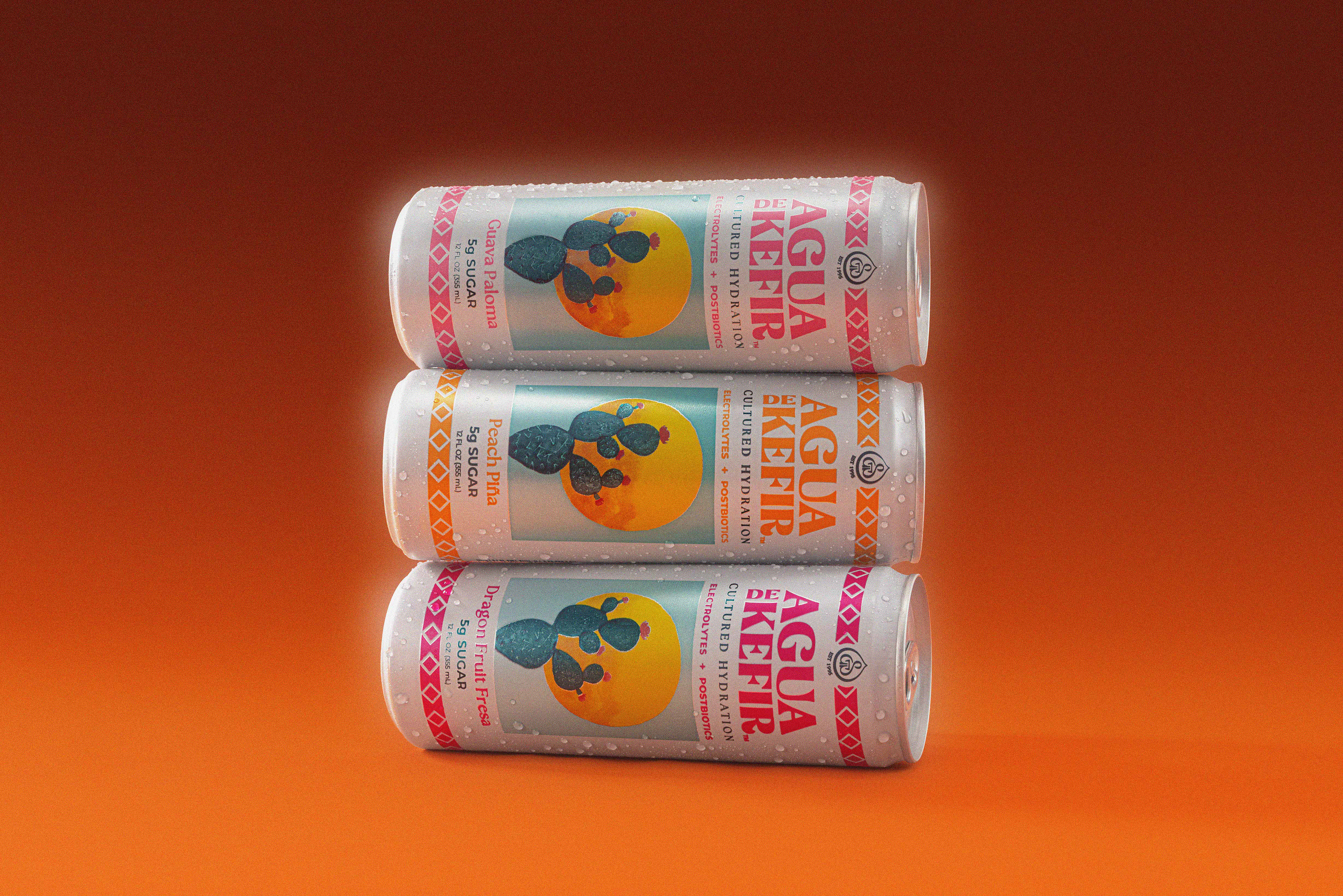
A new logo and packaging system set the foundation. My role was to build the world around it, translating this update into a fully realized, ownable visual identity.
Establishing the Visual Language
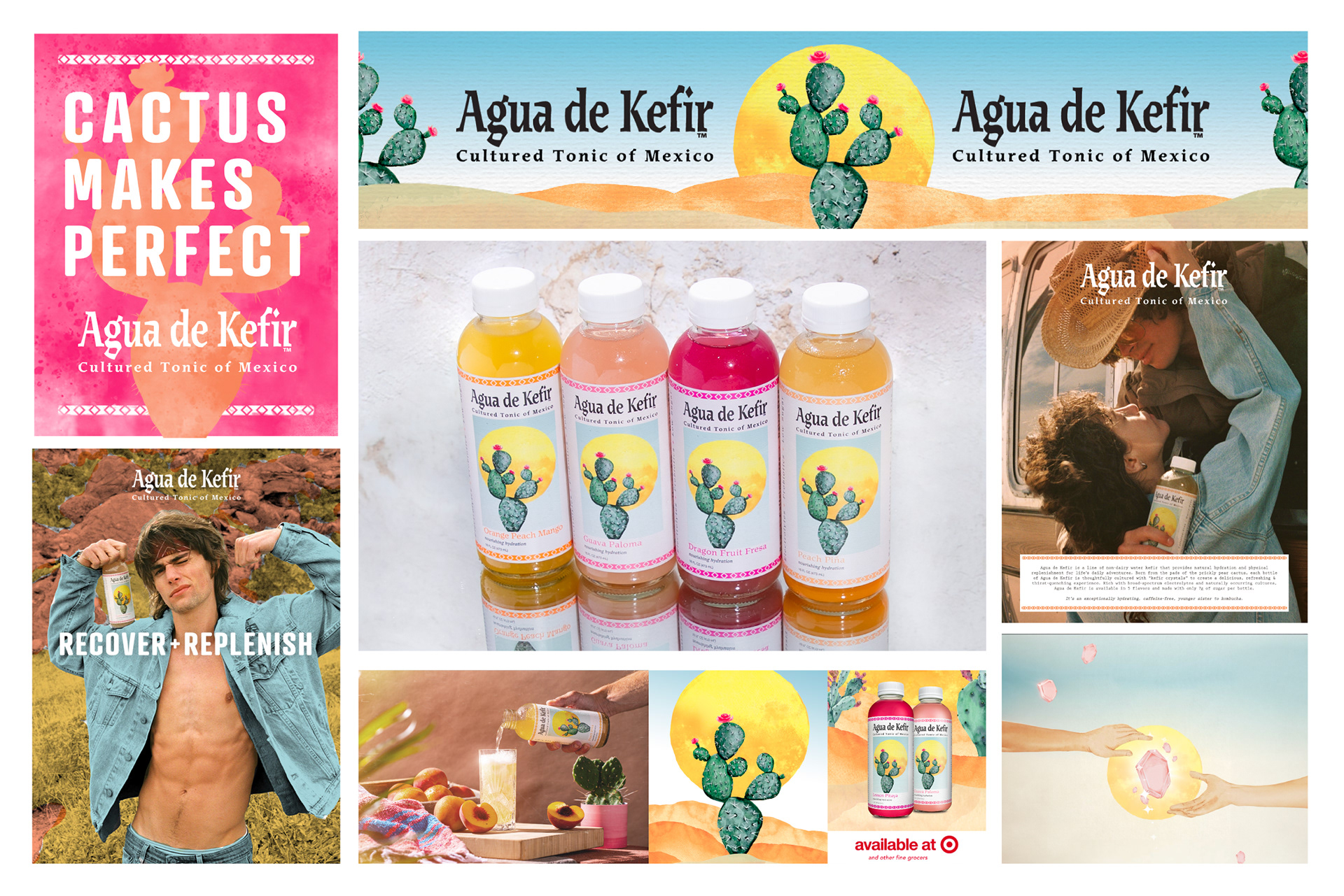
Defined a new visual direction rooted in retro soda advertising, sun-soaked desert tones, and a bold, thirst-driven aesthetic. The goal was to create something instantly recognizable with a clear, ownable point of view.
Building the System
Translated the creative direction into a scalable visual system, defining color, lighting, composition, and typography to ensure consistency across every touchpoint. Built to move fast while maintaining a clear, cohesive identity.